A few months ago, I wrote an article about our approach to colour and contrast in photography.It focussed on the decisions we make both in the moment when photographing and also when editing and post-producing our images.I wanted to explain our thought process and how it is that we arrive at the creative decisions we make with regards to our images.
That piece focussed on colour and contrast and this piece – a companion, looks at something more fundamental: what makes for a good photograph?What can you do to improve the way you look, see and compose your images?By talking about this and our attitudes towards it, I hope it will give you some ideas that will benefit your own practice.
In many ways, this question has a bit of a cop-out answer: I do believe that to some extent you can’t teach good composition.Some people are fundamentally not ‘visual’ and will struggle with making interesting, dynamic images in much the same way some people struggle with maths or languages.However, even for the most visually illiterate person, I believe there are ways you can develop and elevate the images you make.
If you’ve had any sort of formal education in the arts – whether that’s at post-graduate level or simply a subject you covered in high school – you’ll no doubt have done some work around composition.A whole bunch of guidelines – rules, even – for making an image look good are wheeled out: The Rule of Thirds, The Golden Section.Just as importantly you are told what not to do: Don’t put your subject in the centre of the frame.Avoid out of focus elements in front of you sitter.Whilst these rules are presented more as guides to those who had a formal education in the arts – well, at least that was my experience – things get much more extreme in the online world.I’ve seen debates on composition in online forums degenerate to a point where a photographer is brutally flamed for not following the rule of thirds.The rules cease to be guides.They become commandments, almost!
There is some merit in all of this.In very general terms, if you follow these guides – stick to the rule book as it were – you will create generally pleasing images.However, I believe there is – and indeed there has to be – more to the story than this.If all we had to do was to follow a simple set of rules to make great images, then literally anyone could do it.We’d all be great photographers.We all know this isn’t the case and besides, such an assumption leaves no space to account for creative visionaries – to reduce the work and, I believe, genius, of someone like Henri Cartier Bresson or William Eggleston (or Cindy Sherman, or Diane Arbus, or Richard Avedon, or Helmut Newton, or Jeff Wall or…) to a set of simple rules is, frankly, offensive to their monumental talent.
What makes for a good composition? Well, I think every photographer you speak to will have a different answer and I know that Fay and I certainly see differently here.Often, we can be shooting the same scene and the images we make are radically different.We see different things in the same subjects.So, I perhaps can’t give a definitive answer, but I can certainly give my answer!
But before we dive into this, let’s take a moment to talk a little about some theory.If you’ve studied the arts at university level, you’ve likely come across the name Roland Barthes – I’m sure many people reading this are groaning right now!Barthes was an important theorist whose ideas and models of how we experience and perceive images are considered essential reading for art students.He did have some great ideas, but I’ll be honest, from my point of view I always thought his writing was a bit too abstract.The theories seemed too disconnected from the day to day practice of photography – certainly commercial photography.Also, his writing is not exactly accessible – not helped by the fact that when you read it in English you are actually reading a translation.I can’t think how many times I was advised to read a specific essay in his collection ‘Image, Music, Text’ by my university lecturer only to wake up on the sofa with the book still in my hands a few hours later.But amongst his work, there is one text that is, I think, overlooked or underappreciated: ‘Camera Lucida’.At university, my lecturers were very dismissive of this work – they said it was too biographical.There was too much of the author and not enough theory in the work. I was advised not to use the ideas in the text as the central argument in my essays – it just wouldn’t stand up!
I think they were wrong!
In Camera Lucida, Barthes examines how we look at photographs and what it is that we like about them.He introduces two ideas: the ‘Studium’ and the ‘Punctum’.Mangled Latin aside, these words define the two stages of being interested by an image.The Studium is finding something in an image that can hold your attention.Something that makes you want to look at it.The Punctum, though, is much more potent.This is a magical quality a certain image can have that grabs your attention, captivates and holds your gaze and makes you want to return to the image.
Here’s where I think Barthes lets us down – or perhaps did not go far enough – he said that the photographer had no control over the Punctum.It was created by the viewer.It was the sum of the viewer’s experiences, tastes and preconceptions that created the Punctum in the images they saw.This does make sense: it explains why different people like or are captivated by different images and art, but I don’t think it’s the full story.I believe that as a photographer you can engineer your images – through choice of subject or purely composition – to create or at least lay the foundation for the Punctum.At best, your viewer just needs to be a willing participant for all the pieces to come together.
So, how do we do this and how do we work this knowledge into our compositions?
I believe the first step is to examine what you are trying to communicate in your images: are you trying to create a documentary record of a time and place?Do you want to take this further and start conveying the emotion and feeling you experienced in a place at a time?Do you want to present your viewer with something far less literal – something abstract? A much more stylised interpretation of the scene?All of these – and probably more besides – are valid responses and you do not have to know your final intention when you press the shutter release, however, I would argue that your final image will always be stronger if you know your intention when photographing as it will inform how you frame and expose your image: a literal documentary image will likely favour ‘correct’ exposure and focus, whereas something intended to appeal more to the emotions might forego these for creative effect.
Personally, I prefer to make images that speak to my viewers on an emotional level.I like to try to communicate a sense of what I experienced when I was in a place.Referencing again my article on colour, this is why Fay and I often prefer extreme contrast and exaggerated detail in our images – it talks more of our perception of the place.
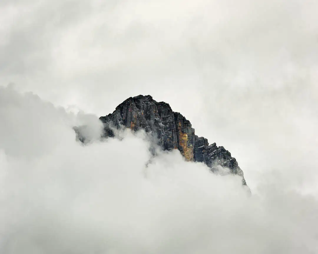
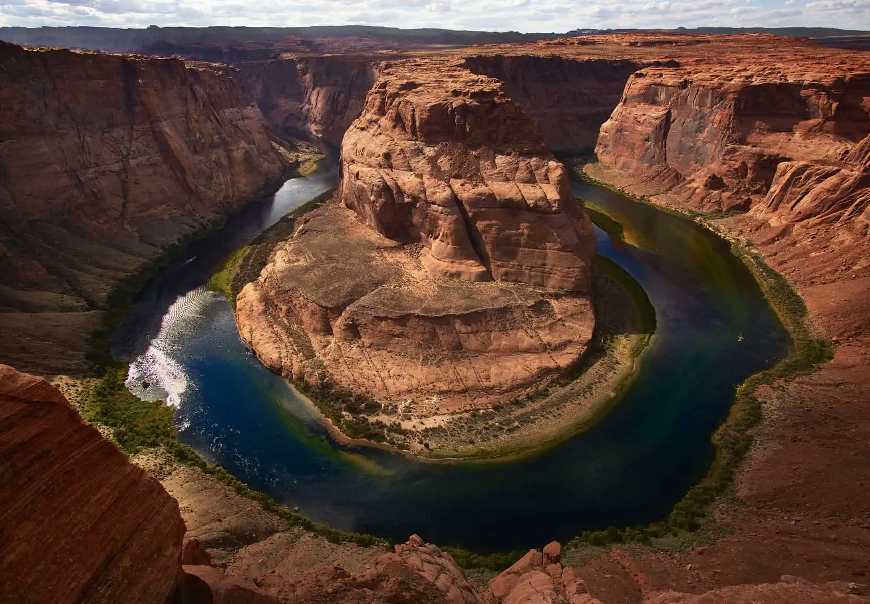
I believe that simplicity and clarity is key in communication, and that is especially true for photography.Thus, I like to keep compositions simple and always look for graphic shapes: does that line of trees forms a pleasant shape when it intersects the mountain ridge?How this manifests in images varies depending on the subject and what presents itself in the scene: In a distant landscape, I might try to make use of different layers of depth in a scene.With closer images I might look for pleasing shapes or patterns in rocks, trees or flows of water.Above all else, I like to exclude the unnecessary and I constantly ask myself if certain elements are beneficial to the composition.If there’s any doubt, I try to adapt my framing to exclude them.With this in mind, I often like to work with longer focal length lenses – I find the greater magnification helps me edit my composition in camera and lead to more coherent images relative to wide angle shots which I often think look cluttered and over fussy.
Next, I have learned to disregard the traditional rules of composition.It doesn’t mean I don’t use them, but I don’t take them as gospel either!If a scene presents itself where placing the main subject dead centre in the frame works well, then I will not shoot otherwise just to adhere to a formal composition rule.
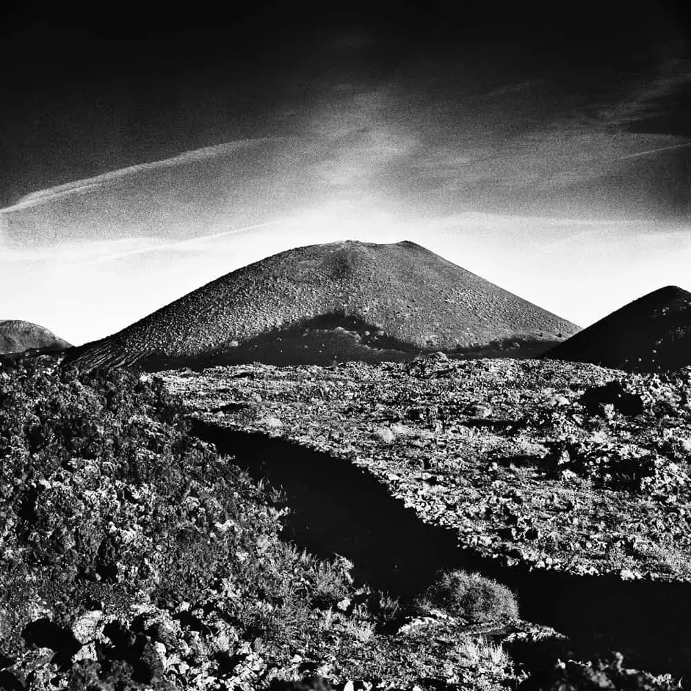
One other thing that I think has helped enormously here was my obsession with shooting full frame.When I started taking photos seriously, I was obsessed with absolute image quality in the traditional terms – maximum sharpness and finest film grain. That meant cropping as little as possible when printing to maintain absolute quality, plus I often used to shoot transparency film which was typically presented full frame.My main camera back then was a Rolleiflex 6001 – a medium format film SLR that produced square images – approximately 6x6cm – on film.The square format was originally marketed so that photographers could crop upright and horizontal images from the same frame, but I embraced the square and presented many of my images this way.Many people told me it was an awkward format to work with, but I found I loved it – I actually find the 3:2 ratio of 35mm film and most digital cameras much more awkward!What I found was that square images lend themselves well to bold compositions – a strong diagonal placed through frame or central subject – or both – can give some very strong and dynamic images.I still use this camera from time to time and I find it a great tool to extract interesting and abstract compositions from scenes.I think forcing myself to work within the square trained my eye and this carries through to my work even now that I’m back to shooting for rectangular formats.
The other thing, of course, is repetition.The more you do something the better you get and both Fay and I have found that since we threw ourselves heavily into landscape photography, our work has gotten consistently better as time goes by.
Finally, I keep looking.I find myself constantly looking at images – whether they are our own, the work of peers or historical images.I don’t just limit myself to photography – I also study painting and illustration and I am always asking myself what I like about images, what makes a certain picture ‘work’?Even when I don’t have a camera with me, I often find myself thinking ‘that would make a good photo’ as I imagine the camera and lens combination I’d use to record a certain scene.
Taken together, all of these things form a process I use when I approach my photography and this helps me capture more visually interesting images.For sure, not all of your images are going to be dynamic and captivating, but by engaging with the process you stand a much better chance of creating something special.
If you are interested in developing your own compositional eye, I would urge you spread your net wide in terms of methods: study images and ask yourself why they work.Look at art.Maybe set yourself a few limitations like working full frame only for a while to see if it helps.Approach your photography with a vision of what you want the final image to look like and what you want to convey with it.Don’t be afraid to try different compositions on the same subject and above all else, engage with the process.If you are taking snapshots, this will help elevate your work to the next level and, if you are already passed this, it will perhaps open up new frontiers of seeing.

