In my mind’s eye, I visualize how a particular… sight and feeling will appear on a print. If it excites me, there is a good chance it will make a good photograph. It is an intuitive sense, an ability that comes from a lot of practice.– Ansel Adams
The negative is comparable to the composer’s score and the print to its performance. Each performance differs in subtle ways. –Ansel Adams
It isn’t a new thing, but we have recently noticed quite a few comments on our Instagram posts where people have complimented our choice of colour pre-set or style.Every time we receive such a comment, we always respond that we don’t work this way.Personally, our opinion is that pre-sets subtract from your work and you will never get the most out of your images if you choose to work with them.We always treat the colour in our images on a shot by shot basis.Every image is different – even two that are shot in the same location – and therefore we believe that every image needs to be individually tailored to look its best.Fay haswritten before about why we think that using pre-sets is bad for your photography, and that article is a good companion for this piece.In this article we want to talk a bit more about the thinking behind our approach to colour and contrast: why is it we choose to work on our images post-capture and what are the factors that influence our decisions?In many ways, this is a very personal, opinion-based piece and we are not for a moment suggesting that you should just copy our approach.What makes an image look good is a very subjective thing – and the things we like and dislike may not resonate with you at all.However, by talking about how we come to make our aesthetic decisions, we hope that you’ll be able to start asking similar questions about your own images and start to build your own visual language.
Let’s start with a bit of history, and by that, I mean let’s talk about our backgrounds.Both Fay and I have formal educations in photography and we both worked in the commercial photography Industry for a long time before we took the step to set up our creative partnership, This Expansive Adventure.Between us, we’ve worked in all manner of roles, from studio assistant to photographer and from darkroom assistant to lead creative retoucher.We have been fortunate to have worked with some massive names in the industry and over the years we have contributed in various ways to prestigious editorial stories and massive advertising productions.Our background has allowed us to see the industry from the inside out.Many people only experience professional photography as a finished product – when they see a story in a magazine or an ad on a billboard – but we have been lucky enough to see and participate in the process at all levels from brainstorming the shoot concept to critical final colour approval on the printing press.This insight has allowed us to develop our opinions on how images should look by working with some of the very best people in the industry.None the less, this doesn’t mean the creative process is always easy or that we always agree on how an image should look.
I started this piece with two quotes from Ansel Adams (1902-1984).If you don’t know who he was, or just know of him from his images, then it’s worth doing a little more research on the man himself.Aside from being an absolute titan of landscape photography, Adams had a strong belief in the value of photographic education and through his writing he effectively defined many of the conventions we now take for granted in photography.One good example here is the time/temperature method of film processing.If you shoot and process your own film, you wouldn’t dream of starting a process run without knowing how long you were processing for and at what temperature, yet before Adams, this was not common practice, and photographers would usually inspect their film under a dim safelight – either red or green depending on the film type – during processing to assess development visually.Adams did not invent time/temperature method, but his writing popularised it and turned processing from an imprecise, almost random act, to an exacting science.
Beyond all of this, Adams developed a strong visual language in his work, and key to that was his concept of visualisation: He worked with the final print in mind.This meant that from the outset, he considered how the final image was going to look.Did he want a dark and moody image or something much lighter and high key?These creative decisions would inform his technical choices: How would he expose the scene? Was it more important to preserve highlight or shadow detail?This led to his development of the Zone System – a method for visualising how changes to your exposure settings and film processing will directly impact the tonal values of the final print.
It is easy to dismiss Adams’ technical writing as a relic of a bygone and obsolete era of photography.He writes about exposing black and white film in large format cameras.He talks extensively about modifying darkroom processes to get different contrast ranges in negatives.At first glance, none of this seems relevant to a contemporary digital photographer and indeed, the technical book of his I recommend the most – ‘The Negative’ – was first published in 1948.However, I would argue that if you see past the antique equipment, his writing is still absolutely relevant to anyone who is interested in developing their photography beyond basic snap-shots.As we’ll soon see, Adams’ techniques and philosophies form the basis of our working method.
One question we often get asked is why do we post-process our images at all?As professional photographers, should we not be able to use images straight out of the camera?This question is more common than you may think and we’ve even heard it from clients on commercial projects.The answer to this is simple: In short, we post-produce our images to make them more like the scenes we experienced when stood behind the camera.
The long answer, though, is a little more convoluted.That photography is a meeting of the technical and the creative is a given, and few would doubt that statement, but we think that many people rather miss the point of this.The technical and creative sides to photography are not two separate facets, but rather two processes that feed into and inform each other.
Let’s break that down with a practical example: Our first response when photographing a scene is to think about how we want the final image to look – for us Ansel Adams’ final darkroom print becomes a final high res file – and this feeds directly into decisions about framing, focus and exposure.But the fact is that modern digital cameras are almost too good.I’m not complaining here, but the fact is they can capture almost too much dynamic range and colour depth in a scene and critically, this range is very different to what our eyes perceive: our brains hone in on certain details, textures or colours and are constantly colour-correcting scenes to emphasis or de-emphasise certain elements and to compensate for atmospheric aberrations.
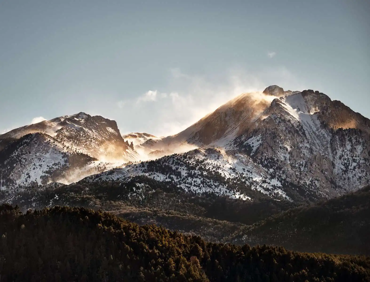
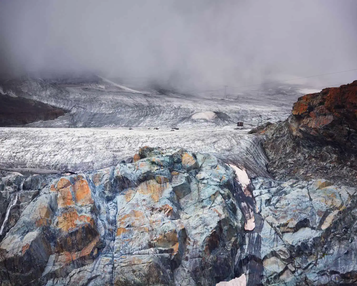
In the Dolomites in Northern Italy, for instance, we often spot red – probably staining from iron oxide – amongst the grey rocks of the mountains.This can range from something that’s quite subtle to very intense.However, the red is seldom visible in the raw files our cameras produce.Further more, atmospheric scattering often lends the distant mountains a blue hue.Certainly, this blue is evident in real life, but in our raw files, the blue is often emphasised (which in turn further supresses any red).
Next, there is contrast.You’ll surely see from even the briefest look at our images that we are big fans of contrast.Yet, the sense of drama we experience when photographing a scene is often lost when we look at our raw files – the beautiful deep tones and delicately separated highlight tones you might see in a bank of clouds can just appear as a few variants on mid grey in your captured file.
Finally for now, there’s the matter of colour.Digital cameras record colours differently to the way the combo of the human eye and brain perceive them.For me, the best – or more accurately the worst – example is green.Put simply, I don’t like the way digital cameras (or even colour film) record green relative to how I perceive it.For me, greens straight out of camera take on a fluorescent, unreal level of saturation or colour intensity.I’ve often joked that foliage looks the colour of something that would give you super powers if you feel into it in a comic book! As a landscape photographer, you can surely see that this might pose a problem!
So, we are left with a mismatch.A scene may have ‘felt’ like it looked a certain way, but the reality of the captured files shows something very different.Our aim with post-processing is to bring the captured files closer to the feeling of the place.
Now, there are absolutely steps that can be taken to get things closer at the time of capture: careful exposure and white balance are two immediate factors.It’s important to note here that neither of these need necessarily be ‘correct’ in terms of how the scene presents itself: if deliberate over or under exposure or setting a non-standard white balance will help in terms of getting the scene closer to your visualisation, then absolutely make use of this!Beyond, this and depending on your camera, it may be possible to set an output profile or fine-tune the colour and contrast settings to further refine the look of the files your camera produces.Of course, it’s important not to go too far here: If you tune your camera too much towards producing files that look a very specific way when you shoot a certain subject type, then you are putting yourself at a disadvantage when you need to shoot something different.Let’s say you optimise your settings so that dark woodlands scenes have added depth and contrast.As soon as you need to shoot a bright scene of, say, mist over a lake, your settings and fine-tuning will work against you.
Post-production is therefore a necessity to achieve our goal of matching our files to our feelings.There’s a misconception that post-production is an invention of the digital era, but I can tell you this is absolutely not true!You can certainly do a lot more in digital post-production than you could in a darkroom, and this in turn has led to a ‘fix it in post’ attitude that unfortunately seems to permeate certain areas of the industry, but regardless of this, I can say from my own experience of working in a commercial darkroom that we were manipulating colour and contrast in images long before digital workflows took over!We’ve also often heard the statement that post-production is somehow un-photographic or somehow less authentic, but it just takes a brief look at the practical history of photography to realise that this is an untrue and uninformed viewpoint.
As I mentioned above, for us, post-production is about enhancing the mood or atmosphere of our images, to bring them closer to our experience of the scene.We don’t generally create colour in our images, but rather build on what’s already there – even if it isn’t immediately obvious.To return to our example of the red in the rocks in the Dolomites, this may not be initially visible in the raw file straight out of the camera, but once you dial out the blue from the atmospheric scattering, you may start to see it and once it’s there, it can be enhanced.Beyond this, we use contrast to build drama and to draw attention to key elements of a scene (with the right adjustments, the flat grey sky may separate into beautifully defined textures of cloud) and we will fine-tune colours to bring them closer to our tastes and perception (the cartoon toxic-waste hues of digital greens get shifted towards a more pleasing natural tone, for instance).We’ll be the first to admit that many of our images reach almost abstract levels in terms of their drama and some people may not like this stylised approach.That’s fine.For us, the contrast and the drama is all about conveying emotion and sharing our experience and perception of a place.
Our approach is built on working with the colours already in a scene, but we know plenty of photographers who like to take things further, building light adn colour from scratch.For us, we feel that this is maybe a step too far, but there are plenty of individuals out there using this approach to great effect.
None of the techniques we use are complex.We typically make minimal adjustments in raw processing software (our favoured choice is Capture One Pro), before bringing the images into Photoshop for the final colour treatment.Why this combo of software?Well, more than anything, it comes down to familiarity.We know this software well and we can use it fluently to get the results we like.This doesn’t mean it’s the only way though – if you are comfortable working in, say, Lightroom, and it gives you results you like, then go for it!You’re not alone!
Image editing software can seem daunting when you first look at it – often when I open a new piece of software I find myself thinking that I’m sat in the cockpit of an aeroplane staring at banks of dials and switches without knowing what any of them do! With this in mind, and perhaps after being confronted with a contrast curve for the first time, you can see why a lot of people fall back on the idea of using a colour pre-set or applying a LUT.However, the learning curve for most modern software is less steep than you would think, and with a little experimentation, and perhaps the help of a few video tutorials, you will soon realise that manual adjustment is a more rewarding and creative route.It’s a bit like learning to use your camera in fully manual mode: it may be frustrating at first, but if you stick with it, the reward is well worth the effort.
Digital photography offers creative possibilities that Ansel Adams would have been amazed by.First of all, we have the ability to instantly review our images to see if we have the ‘raw material’ we will need later.Beyond this, raw processing and image manipulating software gives a level of control and instant feedback that was impossible in the darkroom.The elements are all there and, if you can mediate these with the tools of pre-visualisation and an aesthetic sense from an earlier age of photography, then the possibilities are endless!